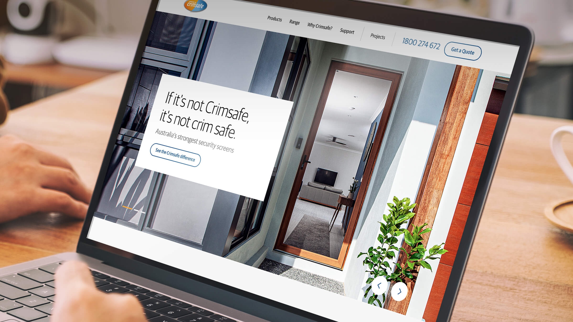
Crimsafe Website
As a category leader and innovator, Crimsafe needs to be not only at the bleeding edge of screen technology, but also technology that enhances the experience of both their licensees and their end customer.
Challenge
What did the client need?
What did the client need?
Crimsafe were facing ever-increasing competition and had a digital presence and infrastructure that was dated and not fit for purpose. Their website was not delivering on the promise of better-engineered, designer products. As market leader, they needed a better online experience and showroom.
/
Solution
What did we do next?
What did we do next?
We designed a site to make Crimsafe the ‘Apple’ of security doors, matching the quality of the product. Clean, clear user flows, with strong CTAs, meant all roads lead to contacting Crimsafe for a quote. Where previously products had been hidden, we made them heroes, using Web 3D to create interactive, engaging experiences — such as the Virtual Showroom product demonstration and the exploded view in The Crimsafe Difference. With responsive design, users enjoy a consistent product experience ‘up close’, on any device.
Results
Some of the highlights
Some of the highlights
100%
increase in website traffic
0.9M
page views
579,800
total users
